IAG Newsroom redesign
Enhancing IAG’s communication effectiveness

IAG is the largest general insurance company in Australia and New Zealand, selling insurance under many leading brands.
Challenge
Enhance IAG’s communication effectiveness through the Newsroom to make it easier for media and stakeholders to engage with the strategy and work.
Objectives
Redesign the Newsroom to make it more usable and engaging.
Create more flexible templates and options for publishing stories via the CMS.
Make it easier for stakeholders to share stories with their networks.
Improve options for media to engage with IAG and find the information they need on breaking news.
My role
Lead UX/UI
Duration
3 months (2020)
Team
I worked with a PO, developers and business analysts.
Initial research
Key findings from an analytics review:
Most newsroom traffic lands directly on a news story from a LinkedIn share.
Most visitors view one page only (story page) and then leave the site.
Key findings from auditing the existing site pages:
The News & Events pages are mostly dead ends with difficult multi-step flows to find more content.
There are many double-ups in the navigation, e.g. ‘Announcements’ is another page template showing the same latest news stories in a different layout.

Image: site map mockup from the audit showing the before stateCustomer interviews with 6 IAG stakeholders and 4 journalists to understand
How they currently engage with IAG’s content
What are their expectations of a news page
Their impressions of the current newsroom
How they engage with news sites more generally

Image: screenshot of raw interview synthesisSynthesised themes:

Competitor and adjacent new site analysis

Image: Competitor analysis stakeholder presentation slidesImage: screenshot of synthesised themesPrototype and test
Articulating key user goals
I created proto-personas based on our discovery interview feedback to communicate key goals and pain points for our focus user groups.

Key hypotheses
Improving searchability and tagging will encourage more people to view articles on IAG’s website instead of general news sites.
Creating more paths between related content, such as suggested articles and category tags, will increase the number of articles people read in one session.
Improving story topic clarity on article lists will increase click-through rates to article pages.
Visual and content type tweaks to article pages to make them more scannable will improve audience engagement and satisfaction with our content.
Embodying IAG’s purpose on the news page will reinforce audience positive belief in IAG.
Making it easy to share articles to social media, especially LinkedIn, from the article pages will prompt people to share and increase viewership.
Making it easier to explore and find content with clear categories, navigation and hierarchy, will increase the average time a person spends on the IAG news site.
Modernising the interaction design will help people interact with the News Site more confidently.
Including tools for journalists, such as media contact links and downloads, will increase journalistic engagement with IAG content.
Mid-fidelity prototype
Testing our concepts with journalists and highly engaged stakeholders for clarity, usefulness and usability.

Image: medium-fidelity prototype for usability testingUser testing synthesis
Examples of actionable feedback included confusion around our category labelling, usability enhancements with our search feature, and clarity on which features to prioritise for journalists.

Image: pages from the Usability test reportImage: Proto-personas from a stakeholder presentationDefining IAG’s first global design system styles and components
The existing IAG website template was inconsistent and put together by different teams using the CMS, without design input. It wasn’t aligned with the brand style guide and was not AA accessible. I defined the UI styles and worked with our global design system team to make them available for future use.

Defining styles and template components for the CMS
I defined a variety of styles and components for the story template to add flexibility to the layouts used to publish stories. These were coded into the teams CMS as page and style templates.
Story text style options:

Story image style options:

Image: some of the Base component styles I created for the IAG design system 'Chroma'Finalising the UI for all pages, and creating templates for key stories for the corporate affairs team
I worked with our external engineering partners as they built out all the CMS styles and pages.
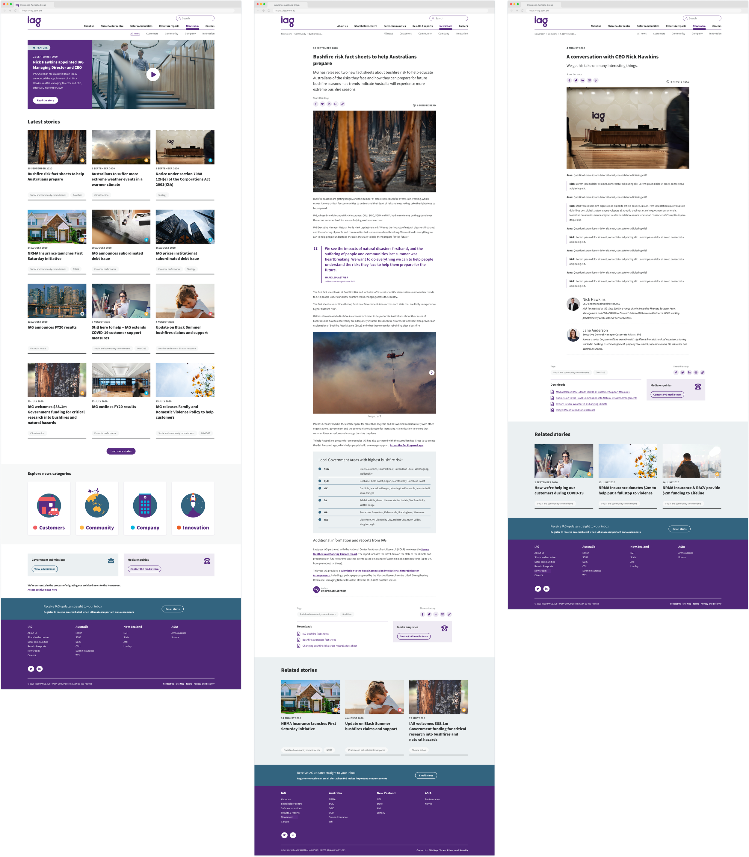
Image: some of the final screens and template mockups showing the available styles for corporate affairsSome headline outcomes
-
Increased engagement
There was a huge increase in site traffic, including the number of stories viewed. The actual numbers sound ridiculous due to the low traffic beforehand, circa 100x improvement.
-
Experience improvements for the internal corporate affairs team
The team that publishes news stories reported efficiency gains, easier tasks when liaising with media, and delight with their template options.
-
Increase in shares
The ability to share stories is highly used and helps to amplify IAG’s content with stakeholders, especially on LinkedIn.